ARYA
USER FRIENDLY FLIGHT BOOKING APP
Case study
PROJECT OVERVIEW
Project Name: Arya – Flight Booking Mobile App
Role: UX/UI Designer (solo project)
Timeline: 6 months
Tools Used: Figma, Miro, Notion, Optimal Workshop
Project Type: Academic / Personal UX case study
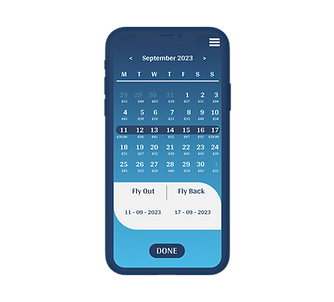
Arya is a mobile app designed to simplify the flight booking experience for European travelers.
Users found booking flights overwhelming due to too many steps and unclear pricing. The goal was to create a user-centric solution that reduces friction, builds trust, and enhances transparency, especially around price breakdowns and booking steps.
From user research to interactive prototyping, I led the full design process to deliver a seamless, intuitive booking flow that addresses real frustrations users face with budget airline apps.
PROBLEM
Booking a flight should be quick and stress-free but for many travelers, especially those using budget airline apps in Europe, it’s anything but. Through early user research and competitive analysis, I discovered that:
-
Users often felt overwhelmed by cluttered interfaces and hidden fees
-
Important details (like baggage rules or seat selection) were buried or unclear
-
The checkout process was long and unintuitive, leading to frustration and drop-offs
These challenges created a lack of trust and usability in the flight booking experience.
SOLUTION
To address the challenges users face when booking flights, I designed Arya as a clean, intuitive mobile experience focused on clarity, trust, and efficiency. The design process was rooted in user research insights and followed a human-centered, iterative approach:
-
Simplified the booking flow to reduce steps and cognitive load
-
Made pricing more transparent by clearly separating base fares, add-ons, and taxes
-
Improved navigation through a clean UI and a consistent layout
-
Prioritized mobile-first patterns for ease of use on the go
-
Integrated helpful microinteractions and progress indicators to reduce uncertainty
The result is a responsive and user-friendly prototype that guides users through the flight booking process with confidence and ease—minimizing stress while maximizing control.

PROCESS
RESEARCH
-
Competitive benchmarking
-
Online survey
-
Usability testing
ANALYSIS
-
Affinity diagram
-
Customer journey map
CONCEPT
-
Flow diagram
-
Interaction design
DESIGN
-
Prototype
USER RESEARCH
In the first few months of the project, I focused heavily on user research to deeply understand the real struggles travelers face when booking flights online. I used a mixed-method approach to gather both qualitative and quantitative insights:
- COMPETITIVE BENCHMARKING
To learn how leading airline apps approach user experience, I conducted a competitive analysis of four major European carriers: Ryanair, EasyJet, British Airways, and ITA Airways. Looking at those different airlines was very insightful and fun.
This analysis allowed me to explore how different companies present pricing, structure their booking flows, and handle optional extras like baggage and seating. I looked closely at: home page, booking process and extras & payment.
Click here to view the research:
- ONLINE SURVEY
To complement the benchmarking, I created an online survey
using Google Forms and shared it across email, WhatsApp, and
social media, targeting travelers across Europe.
I wasn't surprised with some of the responses I received with the
survey: users want clarity in pricing, many found the booking
process stressful and trust and transparency were mentioned
repeatedly as top priorities. I surveyed 25 people.
Click here to view the survey in full:
- USABILITY TEST
To gather observational insights, I ran a comparative usability test where users completed booking tasks on both Aer Lingus and Ryanair apps with focus areas: task completion, error rates, emotional responses and clarity of steps.
During the test It became clear which parts were problematic and also showed places where the app genuinely tried to be misleading! This testing phase helped me clearly validated the need for an app that emphasizes clear communication, simple step-by-step flows and upfront pricing.

analysis
After gathering insights from research, I moved into the analysis phase to make sense of the data and identify key opportunity areas. This step was crucial for translating raw feedback into actionable design decisions.
I focused on two main methods: affinity diagram and customer journey map.
- To organize and make sense of the research data, I used an Affinity Diagram to group and categorize key insights. I reviewed all the feedback/notes from user interviews, survey results, and usability tests and then clustered related observations into themes and subgroups.
This method helped me:
-
Identify common pain points across users, such as confusion with pricing and frustrations with long booking processes
-
Highlight emotional triggers and user frustrations that often went unspoken
-
Uncover critical design opportunities, like the need for clearer communication and fewer distractions in the booking flow
Click here to view the all process of the affinity diagram:

- Next, I created a Customer Journey Map to visualize the end-to-end flight booking experience from the user’s perspective. This helped highlight both emotional and functional aspects of the journey.
For each major step searching for flights, selecting options, reviewing fees, and checking out I documented:
-
The user’s goal
-
Positive interactions
-
Pain points or frustrations
-
Unmet expectations or confusing behaviors
-
Direct user quotes to ground the journey in real experiences
This map helped clarify which moments matter most and where users were dropping off or feeling unsure.
Click here to view the CJM:

concept
With the research insights in hand, I moved into the design phase with the primary objective of addressing the key pain points identified in the Affinity Diagram and Customer Journey Map. The goal was to create a smooth, intuitive booking experience that directly responds to user frustrations and unmet needs.
- To begin, I defined a high-level Flow Diagram that mapped the entire booking process, from the homepage to the payment screen. This visual representation helped me clarify the structure of the app and ensure each step was logically connected.
-
Structure: Each screen or state is represented by a box, while interactions (e.g., selecting "sign in") are represented by circles.
-
Purpose: The flow diagram allowed me to visualize how users would progress through the app, ensuring no steps were missing and that the flow was simple and coherent.
Click here to view the full flow diagram on Figma:

- Once the flow was defined, I moved on to Wireframing. I created a comprehensive list of screens based on the flow diagram and began sketching each screen, paying attention to how the layout and elements would change in response to user actions.
-
Dynamic Screens: I ensured that each state of the app (e.g., logged in vs. logged out, flight search results vs. flight details) was accounted for.
-
Iterative Sketching: I started with low-fidelity wireframes and continuously refined them to establish the best possible flow for users, focusing on clarity, ease of navigation, and visual hierarchy.


WHAT I LEARNED
Through this project, I gained a deeper understanding of the entire travel booking experience, not just from the point of booking but across the entire journey—from planning the trip to returning home. I learned how every decision travelers make is influenced by a complex set of factors, including:
-
Trip planning: Understanding the context and reasons behind their travel decisions.
-
Airport experience: Navigating through the airport, from check-in to security.
-
Post-flight journey: From luggage pickup to transportation to the destination and return flight.
-
Customer support: Ensuring ongoing assistance throughout the journey.
By considering every touchpoint in the user’s travel experience, I was able to design a solution that goes beyond just booking flights and addresses broader traveler needs.
Key Takeaways:
-
User Research: I honed my skills in user interviews and surveys, gaining valuable insights into the preferences, pain points, and behaviors of my target audience. Understanding the root causes behind challenges in flight booking helped inform every design decision.
-
Information Architecture: I learned how to structure content in a logical, user-friendly way, ensuring that the navigation was seamless and intuitive for all types of users.
-
Wireframing & UI Design: I developed wireframes and a visual design system with careful attention to the placement of elements, color schemes, typography, and imagery to create an aesthetically pleasing and functional interface.
-
Holistic UX Design: Above all, I learned how to consider the entire user journey, ensuring the app provides both functional and emotional value—leading to a seamless and enjoyable experience.
Ultimately, this project allowed me to apply the principles of user-centered design in a practical setting, building an app that not only meets the functional requirements of flight booking but also creates a positive and intuitive experience for the user.